DPD Update: New Admin Interface, Responsive Cart tweaks and fixes
- Jason@DPD
- March 18, 2015
- 5 Comments
This morning we released a major update to the DPD admin that brings it in line with our new branding that we’re rolling out across the site. You’ll notice a new, cleaner admin after you log in to DPD.
Don’t be alarmed! We didn’t remove or move around any of the key pages so everything is where it used to be. Here are some of the key changes:
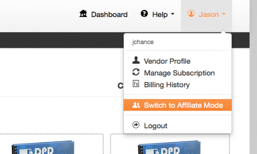
New Header Design / User Menu Layout:
We’ve changed the header to be cleaner and contain all user options, including switching to affiliate mode and logout, in the user menus.
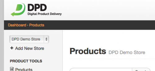
We also moved the store selection and “Add New Store” buttons to the top of the left navigation menu:
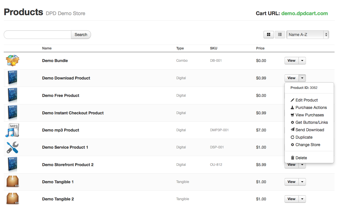
New Grid and Table views for the product list:
We realize there are a couple different categories of DPD users when it comes to number of products- ones with a handful and ones with a ton. To make DPD easier to use for both, we have added new grid and table views to the product list.
The grid view is great for those with a few products. To get to the options for a product you just move your mouse over it and the context menu displays:

The table view is great for those with lots of products, or “Pro” users who want quick access to all product functions from one context menu:
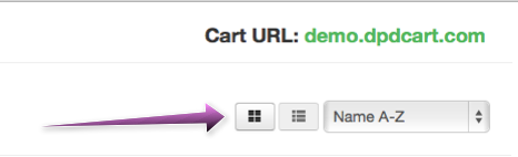
Which view you use is completely up to you- you can select it using the buttons beside the filter and we’ll default to that view each time you return to the product list. To select the view to use:
This is part of our ongoing branding update while we move all services to the new DPD logo and color scheme. You may have noticed the new logo in notification emails and other places around DPD. Next up we’ll be updating the sales site, so don’t be alarmed when it looks completely different one day- we’re still the same service with a new look.
We welcome feedback on the new admin style and product list options, or the new branding in general. Please drop us a line and let us know what you think.
Other Fixes and Tweaks in this update:
- Cart: Fixed email merge var for Dansk translation
- Admin: Removed zendesk tab, added zopim chat/support tab to new admin
- Cart: Fixed v3 cart X-Frame-Options SAMEORIGIN error for some PayPal checkouts
- Admin: Fixed Broken dashboards stats in some cases
- PDF Stamping: Changed PDF encryption to allow annotations when enabled.
- Cart: Updated State / Province translation for da_DK
- Cart: Removed “Language” in favor of globe icon
- Cart: Additional translation for Sweedish
- Cart: Translations for “Add to Cart” and “View Cart”
- Cart: Fixed Sweedish Krona Symbol
- Admin: Allow iframe embeds in ckEditor
- Affiliates: Fixed payout rates for flat rate amounts displaying correctly
- Cart: Removed markdown from short descriptions
- Cart: Fixed order countries by priority, then name
- Admin: Resolve product update subject lines
- Cart: Fixed SagePay fields from sometimes showing on other CC forms
- Cart: Fixed Return if no method was selected
- Cart: Added noscript tag to no-javascript warning on v3
by Taras
Mar 18th, 2015
Thank you guys. Keep up the great work!
by Mark Wilsdorf
Mar 19th, 2015
Some of the changes are nice, but some are more like a “designer’s” makeover of a print magazine: change for the sake of change or a certain “look”, with no eye to useability.
Specifically, I’m talking about your new all-black (essentially, line art) icons on the Dashboard page. Whereas the old icons fostered quick at-a-glance recognition due to color differences, unless one is color blind the new icons are a significant downgrade. Now they’re only recognizable by shape alone–much poorer in terms of human engineering.
Change done mostly for the sake of change in appearance is only an improvement if you happen to be (randomly) lucky.
Years ago Microsoft made this mistake with Microsoft Word: the icons were all converted to grayscale so as not to interfere with the “look” of Windows themes. But are Word’s icons still grayscale? No. If making them all monochromatic was such a great thing, why aren’t they still grayscale? Because Microsoft learned their lesson in terms of useability; now Word’s icons and ribbon controls are now all colored again. Huh. Imagine that.
More recently Intuit went to all monochrome icons in QuickBooks 2013. By the time QuickBooks 2014 was rolled out, and after numerous complaints, they again offered colored icons.
I wish that all web site designers could be grownups, with a bit of experience and attention to useability, more than to lofty, self-inflating, emperor’s-not-wearing-any-clothes ideas about the wonderful and different new “look” or “design” of their site changes.
…sigh.
by Brandi
Mar 23rd, 2015
Love the new look & feel of the admin interface, thanks for all your hard work! One thing I would REALLY love to see is the ability to categorize products (and pull reports for each category separately) – please consider!
by Kelly
Mar 24th, 2015
I love the new look and feel, especially the products page. Are there any plans to update or change the layout of the cart? Currently the images are small, the font on the descriptions is small as well. The new look of the products page is GREAT! Something just like that for the cart would be amazing. They hover over the image and get options of description + add to cart, the cost of the product is under the image, just like in the products page.
I am thoroughly enjoying my experience with you guys!
by Jason@DPD
Mar 24th, 2015
Kelly- Try our new responsive cart 🙂
https://getdpd.com/blog/2015/02/17/introducing-the-new-responsive-cart-and-checkout/